Branding, Mobile app, Illustration
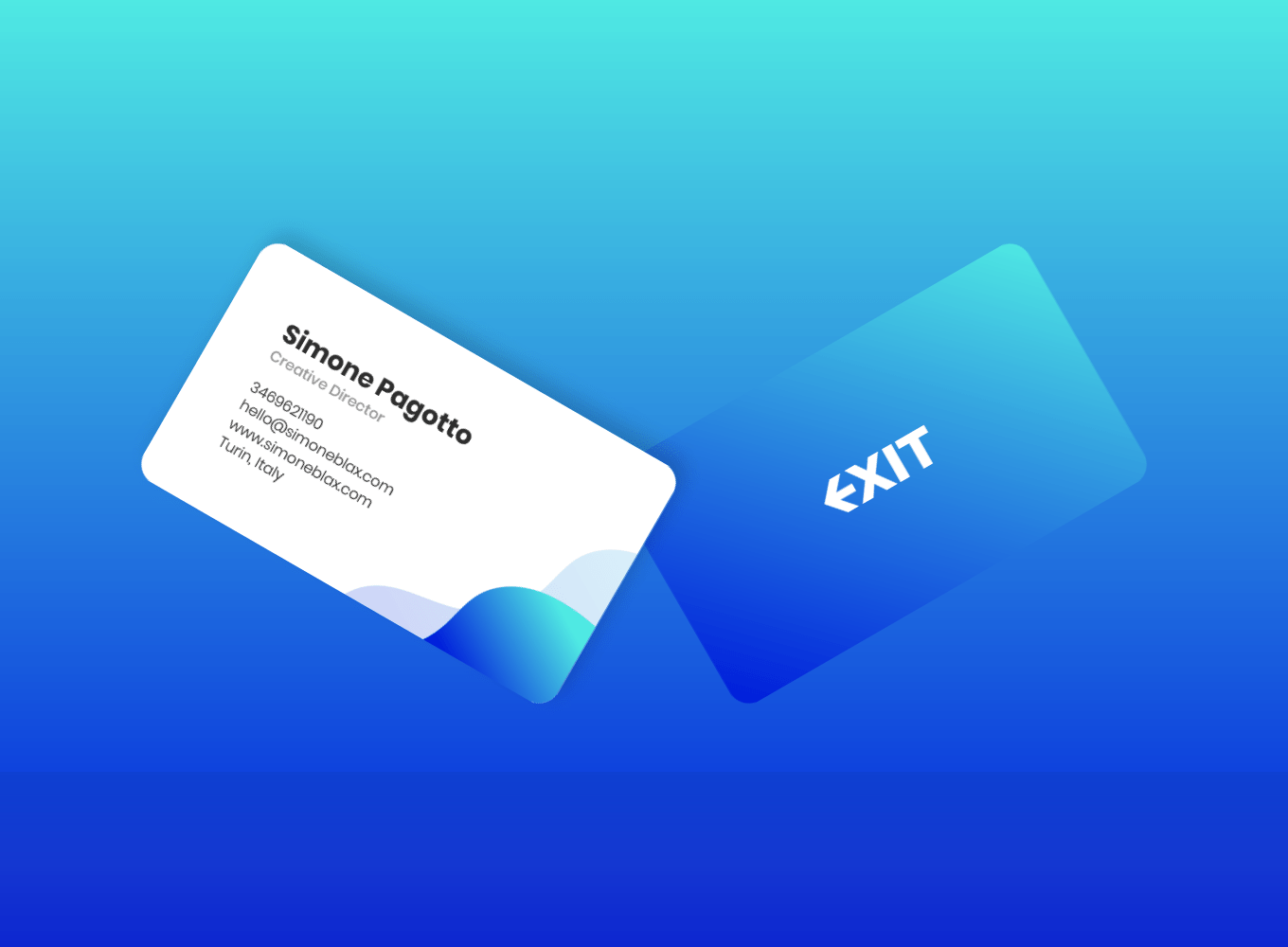
We want to conceptualize Exit idea in a simple mark. The word itself implies some change. We help reduce the number of smoked cigarettes to stop smoking, thus exiting that addiction forever. To reinforce the concept of exit, we have designed an E like an arrow that points outside. I started drafting it black and white to balance shapes and not be distracted by colors, which often mislead people's feedback.
We choose blue as a primary color for Exit's identity because it's often associated with depth and stability and symbolizes trust, loyalty, and truth. Blue is considered calming and beneficial to the mind and body. There's also a black and white variation for legal documents or other cases where we cannot use colors.

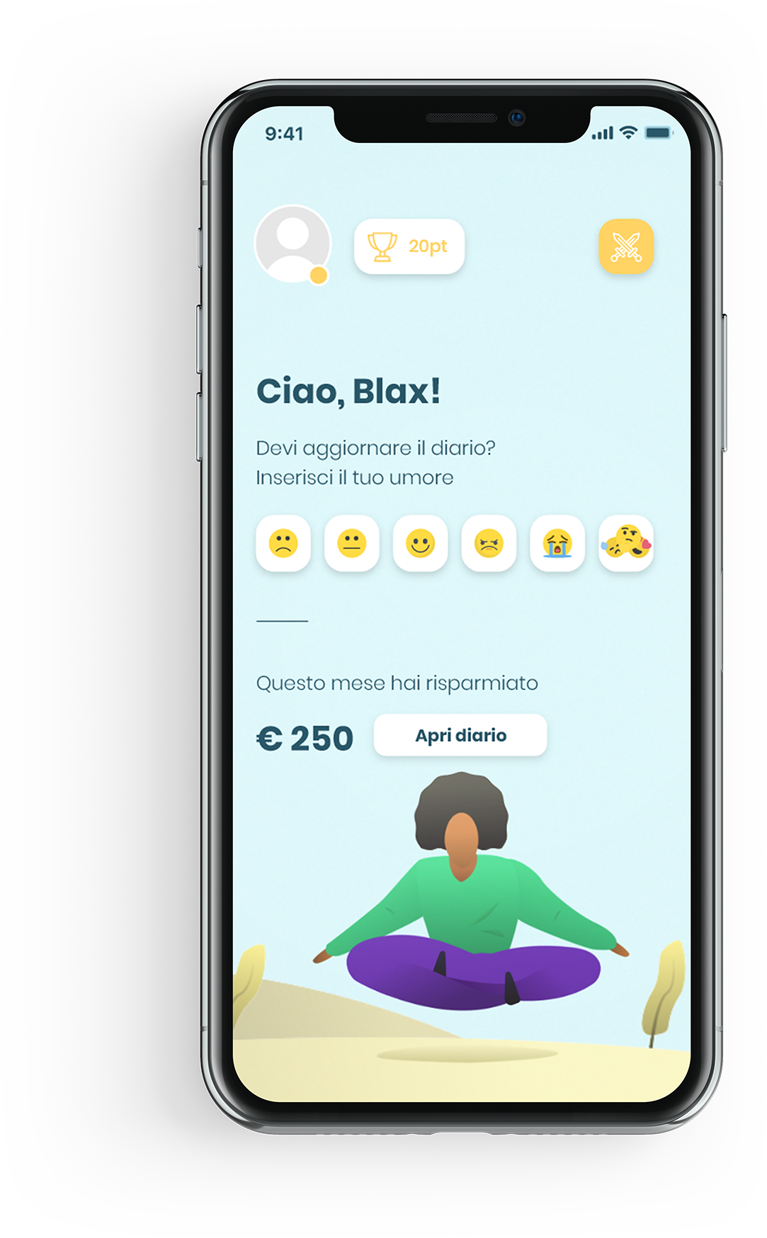
Exit is a full immersive zen app. The user can customize the homepage as he wishes. The app has a gamification system that pushes the user to keep using the app and unlocking the unlimited possibility of UI customization.
• Be aware of your habits
• Keep track of your expenses
• Fully control of your addiction to nicotine
• Take all the in-app challenges you can
• Personalize your zen app
Keep track of your behavior and follow the advice of the day.
Personalize your UI, unlock characters, or zen locations.
Exit motivates you to take different challenges during a day by giving you rewards when you do it.
The signup process is as short as possible to avoid annoying the user.
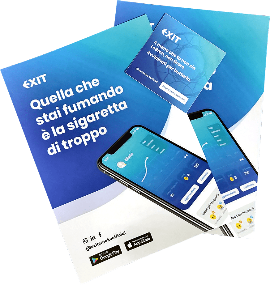
Exit first goal is to build relationships with the community by meeting them in person. In that case, it should have a proper stand full of flyers and stickers to welcome interested people.
Next project