Branding, UI Design


For Aria Energia, we aimed to create a logo that embodies renewable energy and sustainability. The name "Aria," meaning "air" in Italian, evokes a fresh breeze and highlights wind as a key energy source. Thus, the monogram as a stylized gust of wind. We ensured the shapes and balance were perfect before adding color by starting with black and white drafts. The final logo captures motion and energy, perfectly aligning with Aria Energia's mission of providing sustainable solutions.
This section provides a quick overview of all the attempts made before reaching the final result, from sketches to digital iterations, to determine the strongest and most technically correct concept. The team at Aria Energia and I worked closely to ensure that the decisions made were consistent with the feedback received during the Brand Discovery Session, simplifying the process to achieve a final result that satisfied both the client and the essential requirements of a great logo.

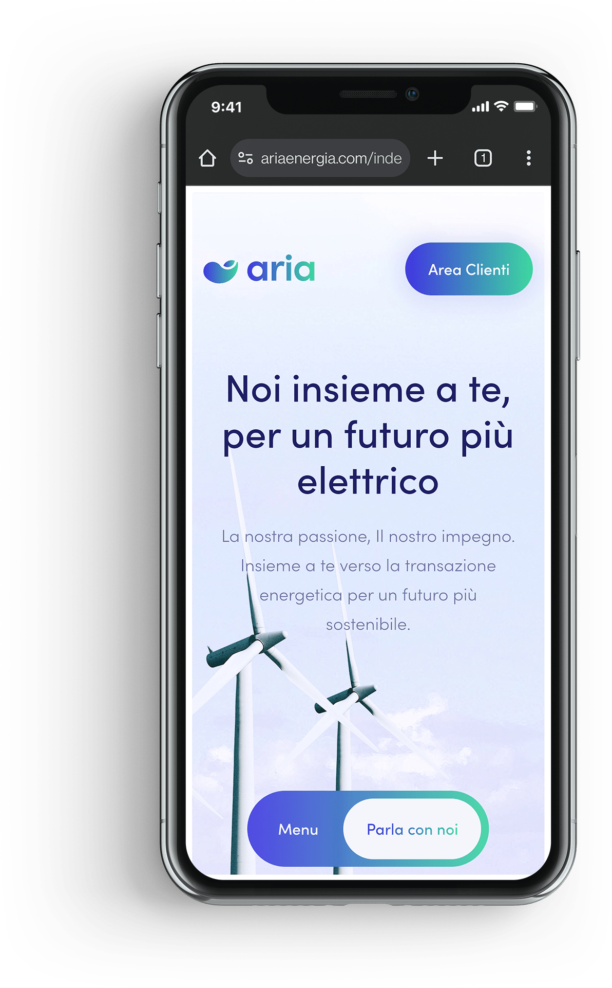
Competitor websites were often overwhelming, with dense layouts and confusing navigation. They lacked engaging visuals and user-centric design. To stand out, Aria Energia's website focuses on simplicity, intuitive navigation, and seamless performance, ensuring an easy and engaging user experience.
Another problem we fixed was consolidating all the modules into a single page, preventing users from getting lost in endless subpages and feeling frustrated. This made the overall navigation smoother and more user-friendly.
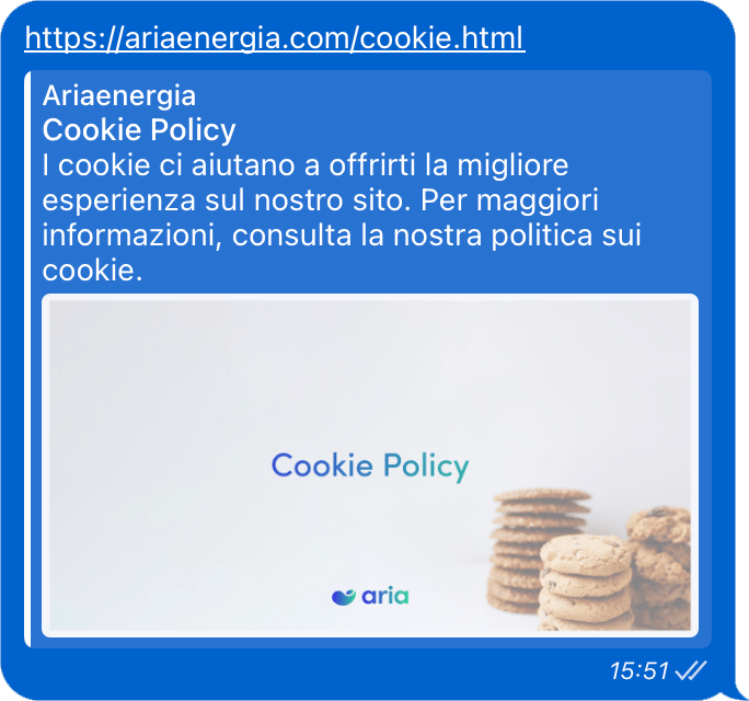
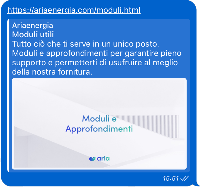
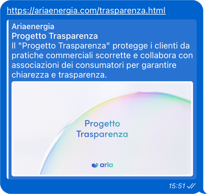
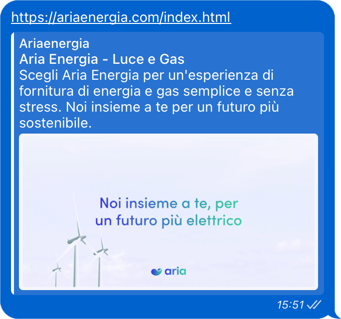
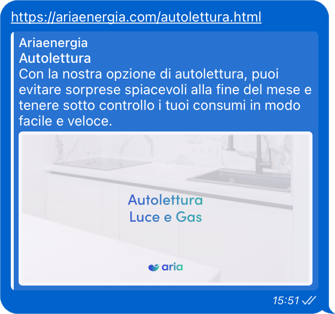
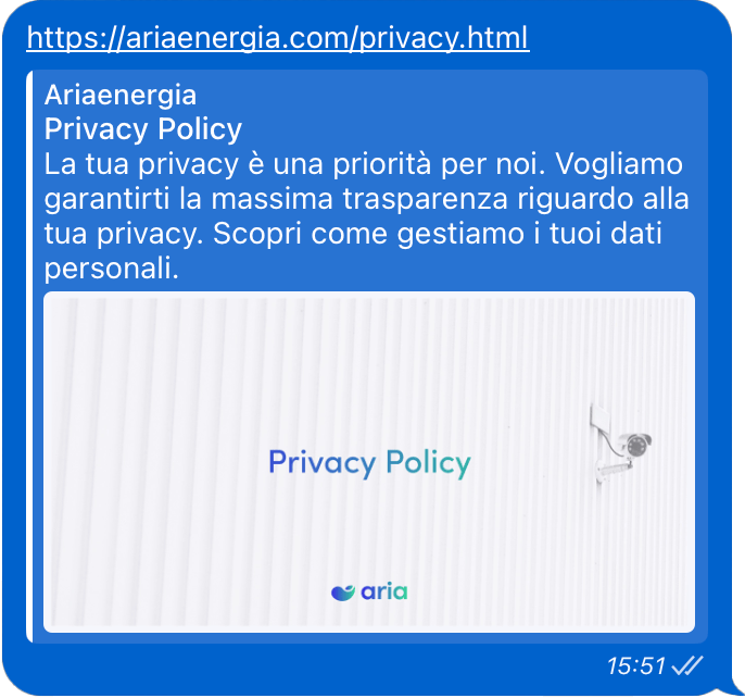
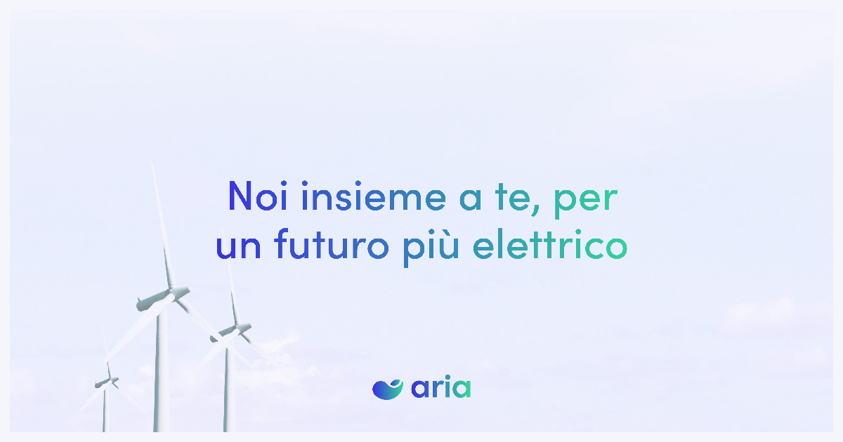
To maintain visual consistency of the identity across all the web pages of their site, we have created previews of the pages that appear when their links are shared online.

Next project
