Branding, UI Design

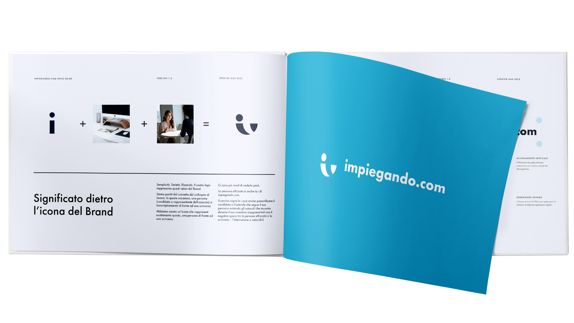
Simple. Serious. Elastic. The Brand represents these values. We started with the concept of the job interview. On these occasions, a person is typically in front of a desk. We created an icon to represent exactly that. There are multiple ways to look at it though. The stylized person is also the i of impiegando.com. The dot on the i can also personify the candidate or company following their path while avoiding the obstacles they encounter on their way, which is represented with the negative space between the stylized person and the desk.

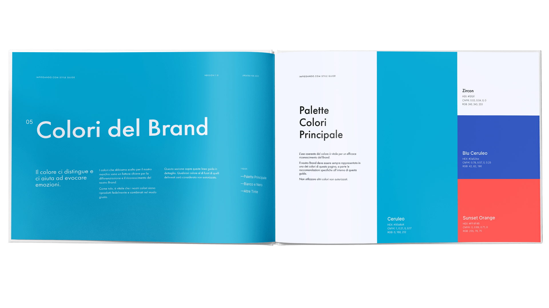
When we got to choosing the color it was rather simple. We knew we wanted to convey trustworth, self-expression and joy. I proposed them many shades of blue, but we all agreed Cerulean was ours to keep. It immediately felt refreshing and new. Studying their competitors identities showed us the lack of a differentiation because they all use pretty much the same color.


Less is more. Our competitors websites were too crowded. We didn't want that confusion in the user experience, so we tried to simplify it to make it more concise and clear. Once you land in the homepage, you can click one of the two buttons that ask you if you are a company or a candidate seeking for a job. While keeping in mind simplicity, the only thing you see if you scroll down the page is a list of highlighted companies.

Next project