Branding, Creative Direction
The concept behind the Sprintaly logo centers on a dot with a trailing streak and an incline, symbolizing a sprint in motion. This dot represents the sprinters who, within 72 hours, follow our intensive methodology to prototype and pitch a project from scratch. The wordmark "sprintaly" combines "sprint" and "Italy," highlighting our mission and identity.
While an animated logo wasn’t essential for Sprintaly, I saw an opportunity during the 2023 event. As the sprinters worked tirelessly to develop their prototypes, I adopted their sprint mentality and used the limited time available to create an animation for the logo. This animation enhances the brand perception and clearly conveys the meaning behind the logo's elements. To support the team, I also prepared easily integrable assets for social media, making it simpler for the editors to include the animation in their content.
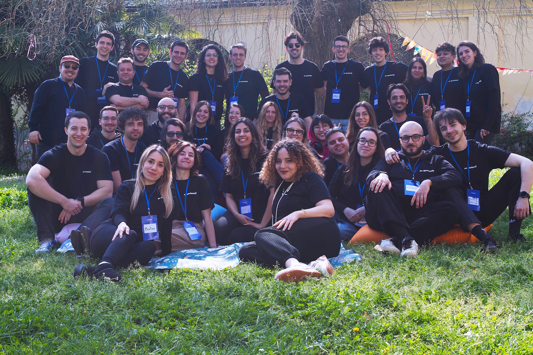
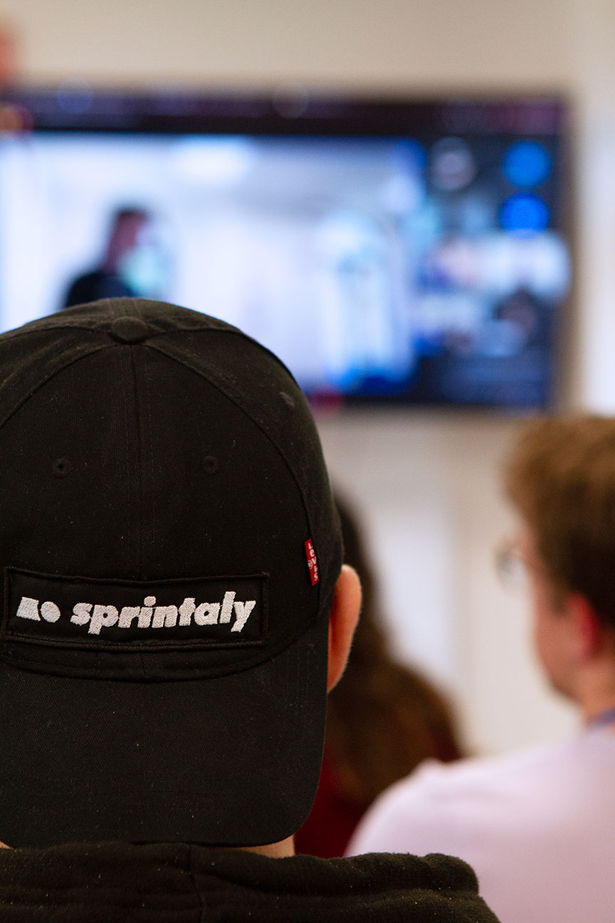
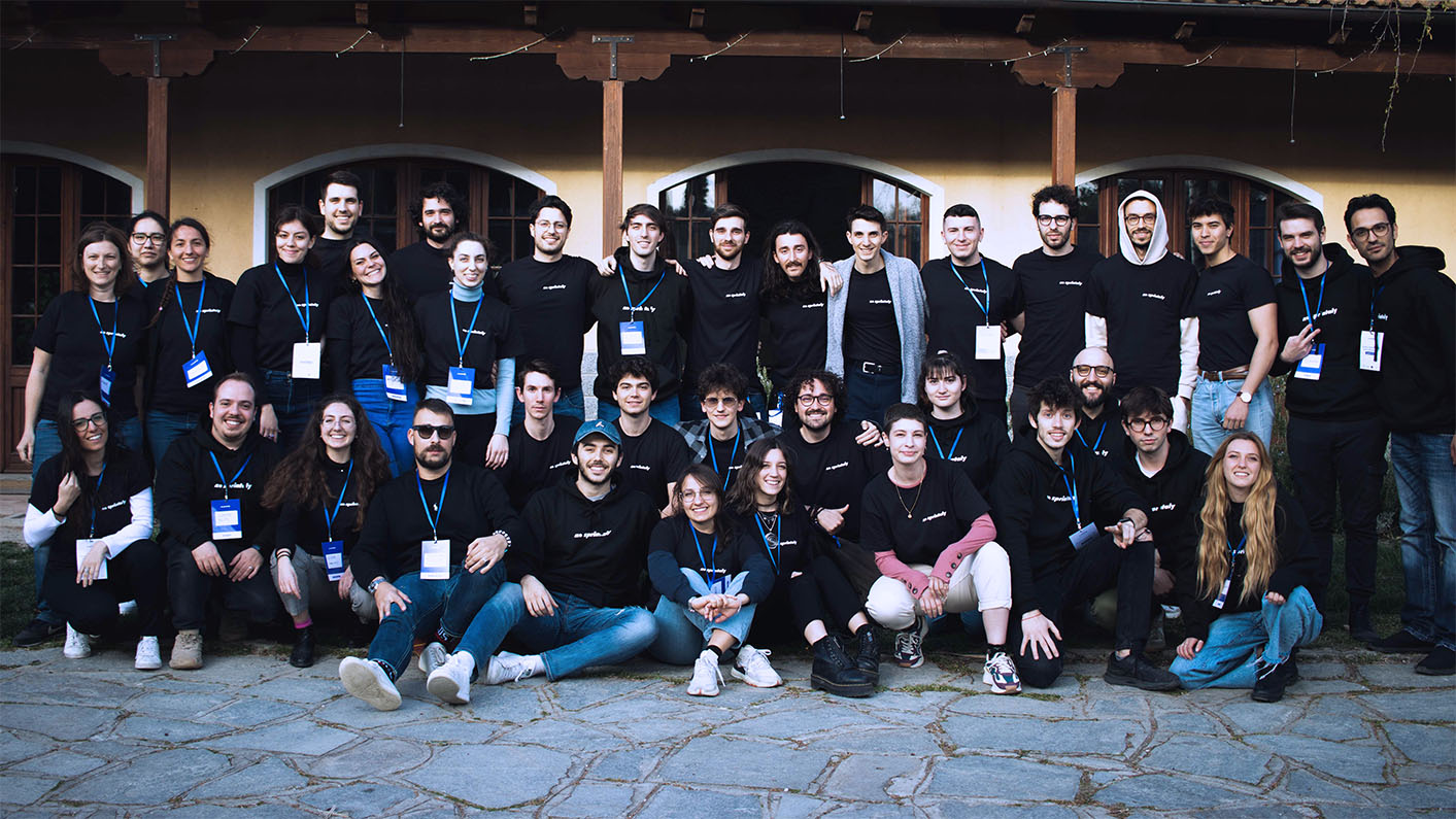
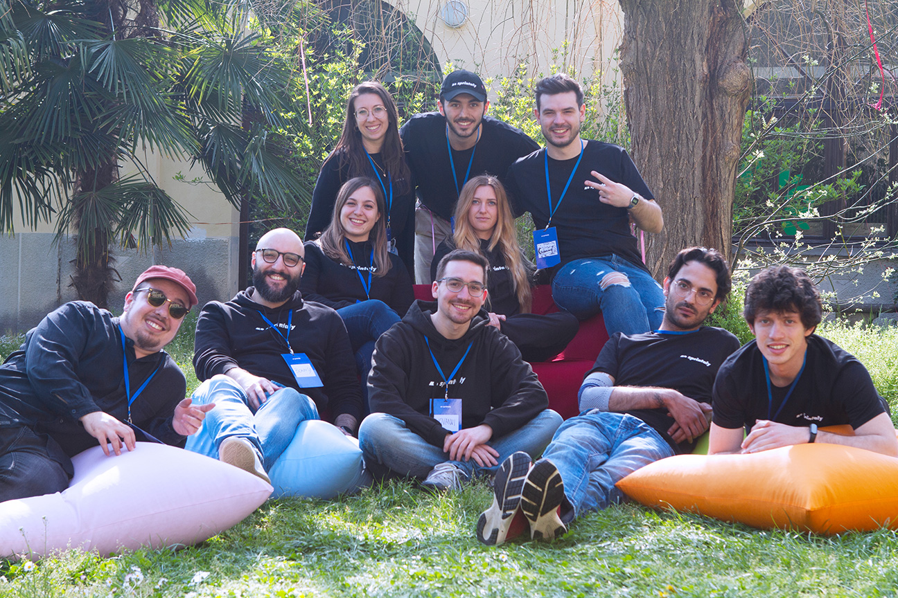
For the event, I managed the entire merchandise creation process, from design to final production. We crafted badges that in the first edition displayed participants' roles (Sprinter, Staff, Expert), featured sponsor logos, and included a link to the Notion page with all event details. We also produced t-shirts, hoodies, and stickers to enhance the event’s branding. Additionally, I designed slide templates for the Sprintaly facilitators and created an animated timer for breaks and activities, ensuring a seamless and engaging experience throughout the event.



Next project
